
Mac and Cheese vs Website Design: What's the Connection?
Today, we’re diving into the evolution of macaroni and cheese over the years and how your website design should adapt to connect with your audience. Kraft Macaroni and Cheese, a classic favorite, has been around since 1937. Back then, it was the pioneer in introducing ready-made macaroni and cheese in a box. In the first year alone, they sold a whopping 9 million boxes of this iconic product.
Fast-forward to today, Kraft Macaroni and Cheese is still incredibly popular. We'll be looking at how Macaroni and Cheese has changed over time, but our main focus is on how upgrading your website can help your company. We'll talk about the benefits of a website overhaul and how Broadstreet.net can assist you in this process. Let’s explore how to make that happen!
The 1937 style:
Back when Kraft Macaroni and Cheese first hit the shelves, it had a classic blue and yellow design. As you can see in the image above, the box design is far different from what we see in stores today. During that era, it was called Kraft Dinner instead of Kraft Macaroni and Cheese. Incredibly, it was advertised to feed a whole family of four for just 19 cents! That’s really cheap, even for that time.
Just like how Kraft changed their colors and designs over the years, it’s important to think about what colors and logo you should use for your website. Consider how, when you encounter a television show depicting the 1970s, the vibrant hues of yellows, oranges, and greens instantly evoke that distinctive era for you. Trends in colors change just like fashion, so it’s essential to keep up with what’s popular in modern times. Your logo is an important design choice as well. If it needs an upgrade, don’t be afraid to change it. To learn more about logos click here.
The 1953 style:

Sales were still off the charts for Kraft Macaroni and Cheese, but in 1953, they decided to change the way their box looked. They switched to a yellow and red design, but consumers didn’t respond favorably. For more than a decade, their box had been mainly blue, and changing the colors didn’t increase sales. Instead, kids would ask their parents for the blue box macaroni and cheese because that’s what they knew it as. Kraft had made their brand recognizable.
Similarly, when you’re creating your brand, you need to think about what you want people to recognize and remember about it. Now granted, it’s true that Kraft didn’t set out to brand their macaroni and cheese as the blue box, but today’s companies are more aware of branding and its importance. So it’s vital to make your brand stand out, just like Kraft’s blue box did. For more on online presence…click here.
Branding is the face of your business. It’s what people remember, and it influences how they perceive your products or services. A strong brand builds trust, loyalty, and credibility among your audience. It’s the reason people choose Coca-Cola over generic soda or Nike over other sports shoes. Your brand is your promise to your customers, telling them what they can expect from your products or services. For more about branding…click here.
The 1987 style:
After the flop in changing the color scheme, Kraft Macaroni and Cheese went back to the classic blue in 1954. Staying true to their blue, we flash forward to 1987. Kraft rearranged the way they display the words on their box. Rather than being a Kraft Dinner of Macaroni and Cheese, they switched to being a Kraft Macaroni and Cheese dinner. On this box, Kraft was giving away baseball cards in each dinner bought. Major league baseball attendance had reached an all-time high in 1987. Kraft capitalized on this trend by offering baseball cards, making their product even more appealing to consumers.
What can we learn from this? It’s all about partnerships. Kraft teamed up with baseball, a hugely popular sport, to make their product more enticing. Just like Kraft, businesses today can benefit from smart partnerships and collaborations, making their products or services even more attractive to customers. So, remember, finding the right partners can be a game-changer for your business. For the benefits of having a partner… click here.
The early 2000’s style:

What’s the lesson here? It’s all about communication. When you’re selling something, it’s important to communicate clearly with your customers. Businesses today have no excuse in not using social media to talk to their customers, share updates, and keep everyone in the loop. Effective communication helps businesses connect better with their audience, making sure everyone knows what’s happening and what’s being offered. Read our article on how we suggested our clients communicate with their customers during Covid 19.
The mid 2000’s style:

In 2015, Kraft announced they would remove the dyes and use natural spices instead. Though this has not changed the flavor of this beloved staple, with all the controversy to have the dyes removed, Kraft was smart to advertise their new dye free macaroni and cheese.
What can we learn from this? It shows that today’s consumers are really savvy about business practices. They aren’t afraid to speak up and make their opinions heard. For businesses, this means it’s essential to listen to your customers and be aware of what they care about. Taking advantage of this awareness can help a business grow and succeed. Read our article about reaching next generation of customers.

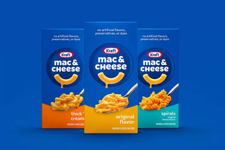
The newest style:
The latest Kraft Macaroni and Cheese box is much more simplified. Keeping the blue box, they have taken away the extra macaroni in the background, while keeping the main image of a beautiful spoonful. They’ve also simplified the name, stating that they are advertising it as what everyone is familiar with: Mac and Cheese. A very clean new look for Kraft.

If you have any questions, comments, or to get your free 30-min consultation with one of our representatives, please call (803) 575-0564. For a list of our services…click here.